A Timeline of Resource Use
Stuck at home + data = graphs!

I'm a bit of a data nerd. And like many fortunate people, I'm still working from and generally staying home and have a lot spare time on my hands. So what does that combination result in? Graphs!
I decided to take Stackery's data of the resources our users provision in the app and map them over time, to see if I could spot any trends, and also track the time between adding a new resource and it being incorporated by our users (spoiler alert: less than a month in pretty much all cases!). So here it is:
Resources added over time
What you're looking at is the number of each AWS resource type uniquely added by our users over the period of each month, from our launch in early 2017 until the present (with incomplete data for June 2020).
In general, Functions (Lambdas) dominate, though there is one surprising moment in the summer of '18 when Docker Tasks take the crown. For those deep in the serverless vs. containers war, it's a tense juncture. Don't worry, serverless fans: Lambda comes out on top, with Object Stores (S3), Tables (DynamoDB) and API Gateway resources constantly jockeying for second. It's also nice to see the HTTP API come out so strong from the gate right after its launch this March. Almost as exciting as a marble race!
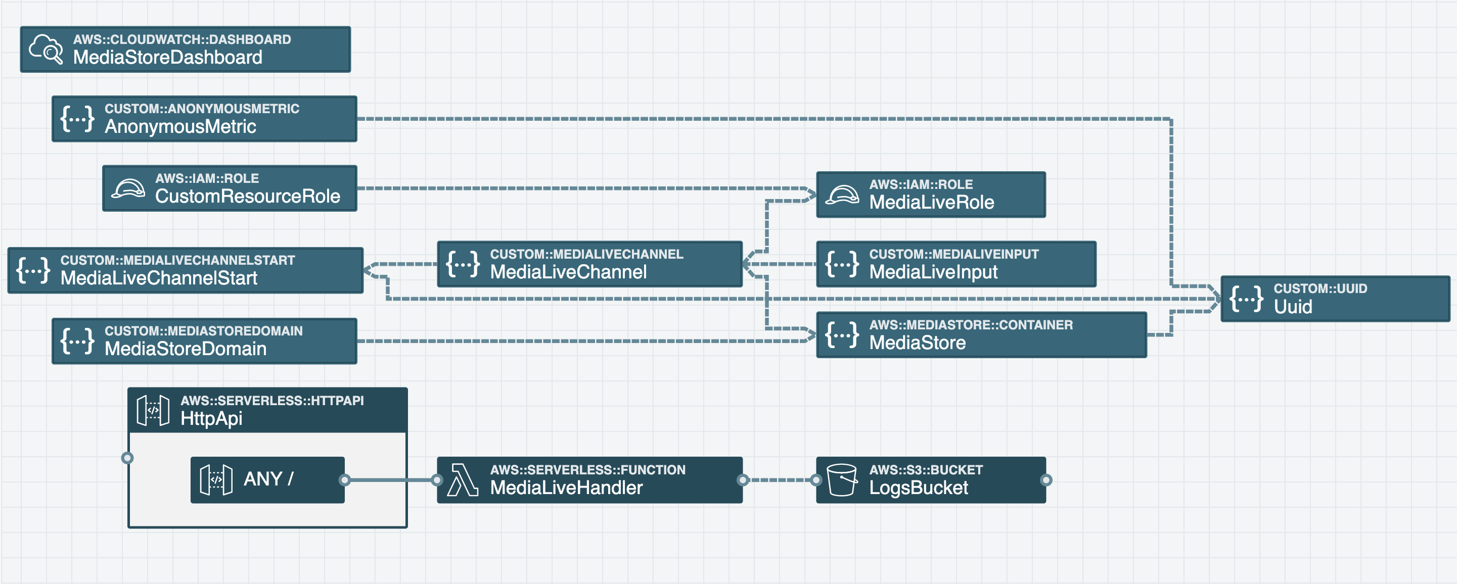
Of course, you can view our supported AWS resources doc for the full list of resources available in the Stackery Dashboard. And if a resource you need is not on the list, don't worry - you can still add it to your template file and we will automatically visualize it, like so:

Hope this amuses our readers as much as it amused me to make, and that you keep building awesome serverless apps with Stackery!
Related posts


Truly composable and maintainable CloudFormation is now within reach